ATMs vary from bank to bank. Some are more user-friendly than others, but the majority are riddled with user complications. We wanted to design a concept for a more accessible ATM.
Our research began by interacting with various ATMs ourselves. We completed simple transactions at a few banks and no-name ATMs found in corner stores. We documented problems we had while navigating the system, and empathized with users who may have mobility, hearing, or visibility impairments. We imagined issues these users might face while using ATMs to give us a better idea of how our design could be more accessible.
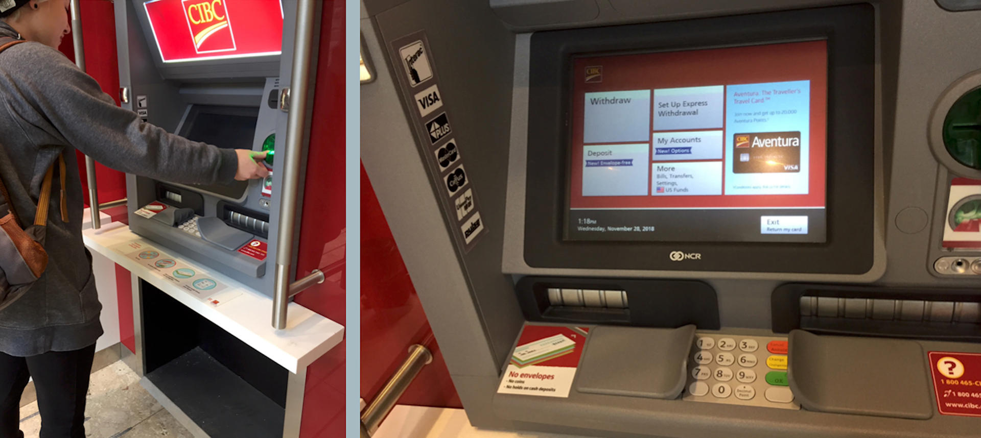
The issues we found that demonstrated the least consideration of accessibility were: the poor alignment of buttons to on-screen features, having no space for personal belongings, and having to raise the arm for extended periods of time. These ATMs also demonstrated limited levels of security. While they provide small guards to protect pin numbers, they don’t protect your personal information from displaying on a screen in front of people waiting behind you. We aimed to solve all of these issues by redesigning the average ATM as a tabletop with a tilting screen.

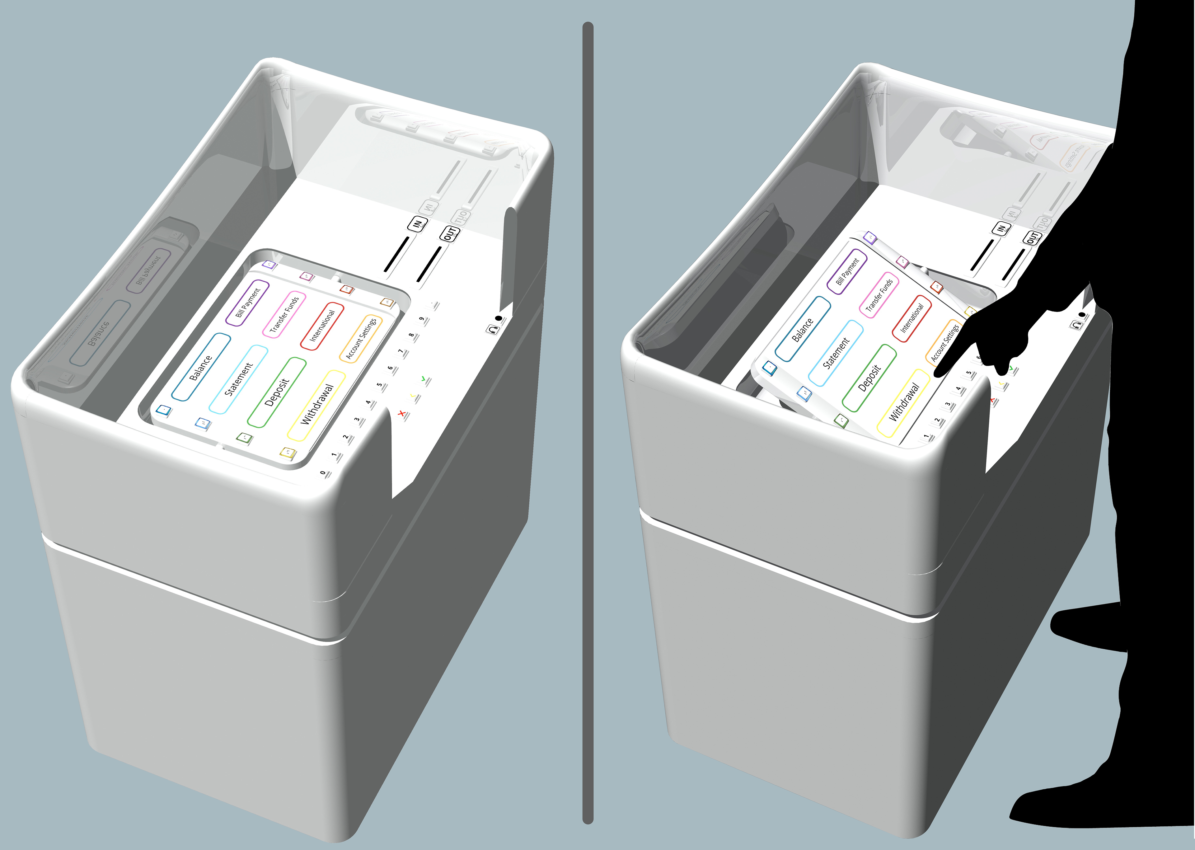
The ATM would be made of white acrylic so any belongings, cash, or cards would be extremely visible and not forgotten at the ATM.
The main screen for the ATM (after you enter your card and pin), has been designed using a 3 column grid. The four most common transaction options are placed on the left and span two columns. The four transactions used less frequently are placed on the right and span one column. This makes navigating the system and finding your options much easier, as users read left to right naturally.
On some ATMS, we noticed keypads that included blank buttons. This was redundant and confusing so we rearranged the keypad into a straightforward line.
The card would be inserted downward, similar to how hotel doors accept keycards for entry. This way there’s far less time spent deciding which way to insert the card. By sliding it down, the only options would be which direction it faces, this can be communicated through a very simple illustration showing that the side with the chip will be facing the user when inserted.
The screen would not be touch reliant, so that even users with visibility limitations can use the ATM easily. To ensure that the buttons can be found by those with very limited sight, braille would be used on each button and headphone access would allow the ATM to read their options and refer them to the necessary buttons. To keep the buttons properly aligned with content, we decided to colour code the content to the buttons. Each colour used is easily distinguishable from the ones near it. Content would be displayed in a coloured box, while the corresponding buttons would be surrounded by LED lights with matching colours. This way users can navigate the interface with ease.
The screen would sit over a dipped section of the table and would be supported by a rod which would allow the screen to be tilted towards the users optimal range of sight. This feature is important so that users can see the screen at 30 degrees, which is the ideal angle so that eyes are not strained while using the ATM.
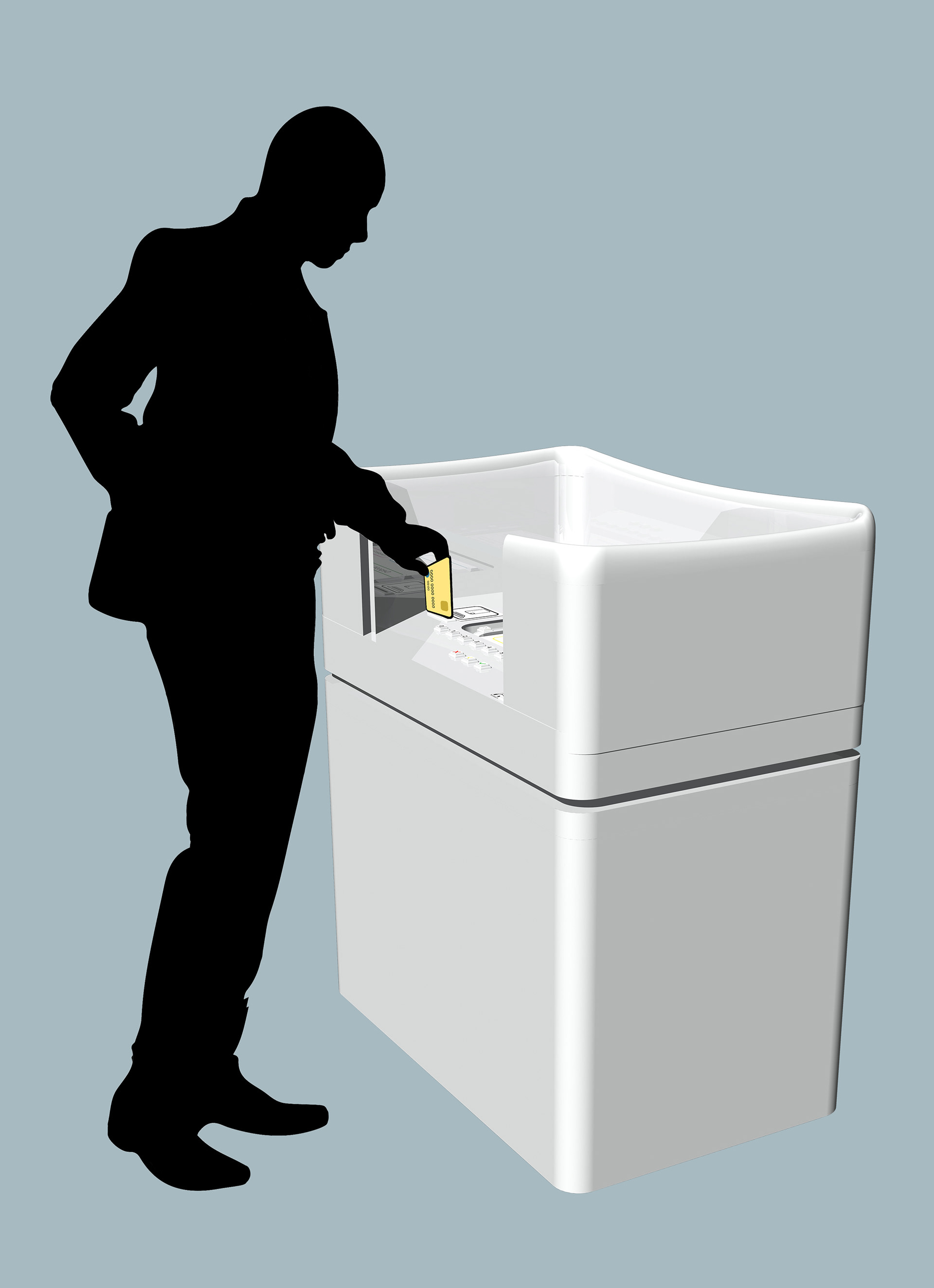
The ATM itself would be one metre high, which is slightly lower than the average male waist, a bit higher than the average female waist, and below average shoulder height for users in wheelchairs. This was determined so that a broad range of users could comfortably interact with the ATM.
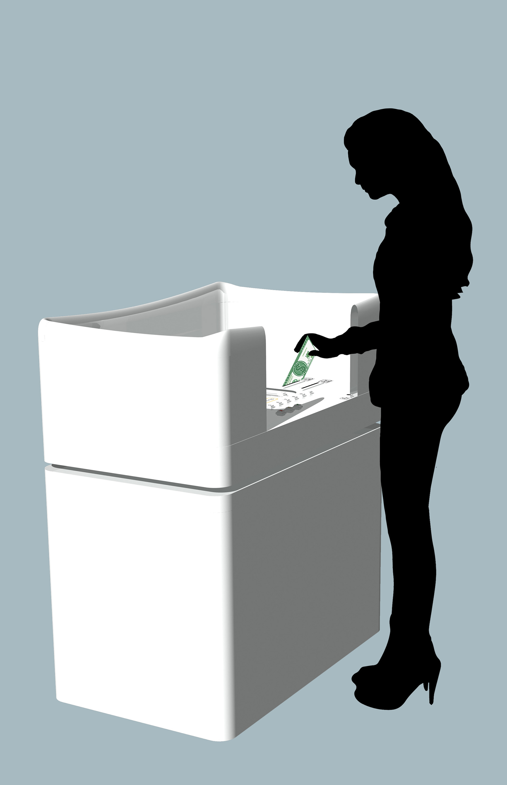
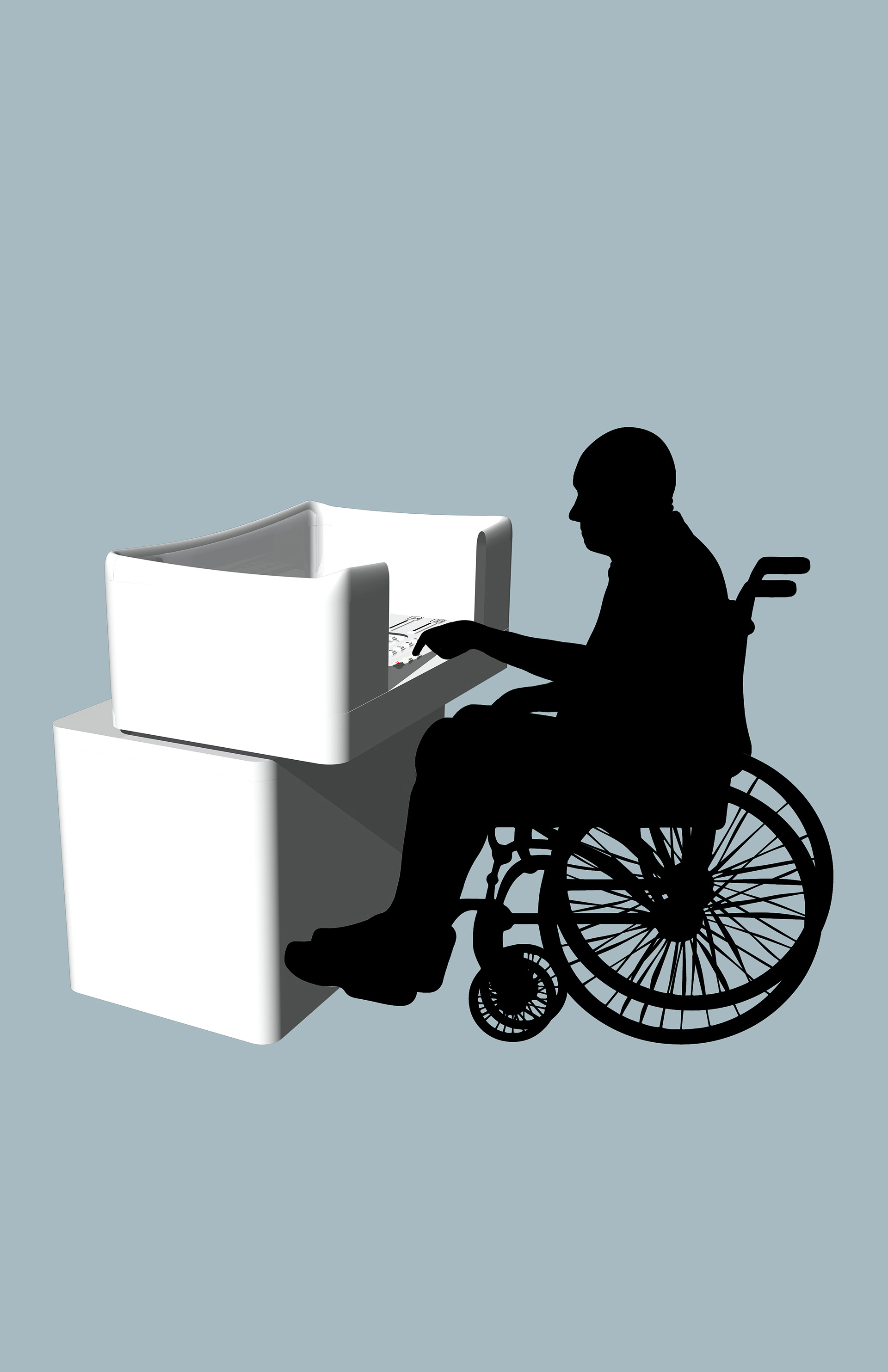
To ensure optimal accessibility for wheelchair access, the tabletop of the ATM would be movable. Little strength would be required to pull the entire tabletop over the legs of the user. The tabletop would be attached to the main body of the ATM on a track and small wheels to make the movement effortless.